01
Mobility & access
Travel times, public transport networks, and access to jobs and services.
Ran (Jora) Ju · London
I’m a Mathematics with Economics student at UCL. I use quantitative and spatial methods in projects on housing, transport and environmental inequality.
SELECTED WORK · 2026 RAN JULONDON2026

 London Housing affordability
 Chicago Rail access
Research interests
Travel times, public transport networks, and access to jobs and services.
Housing affordability, spatial sorting, and variation between neighbourhoods.
Urban heat, green space, and unequal exposure to environmental risk.
Selected projects
Two analyses using public data
Each project includes the question, data, method, main result, limitations and the Python code used to produce the figure.
HOUSING AFFORDABILITY · 2019
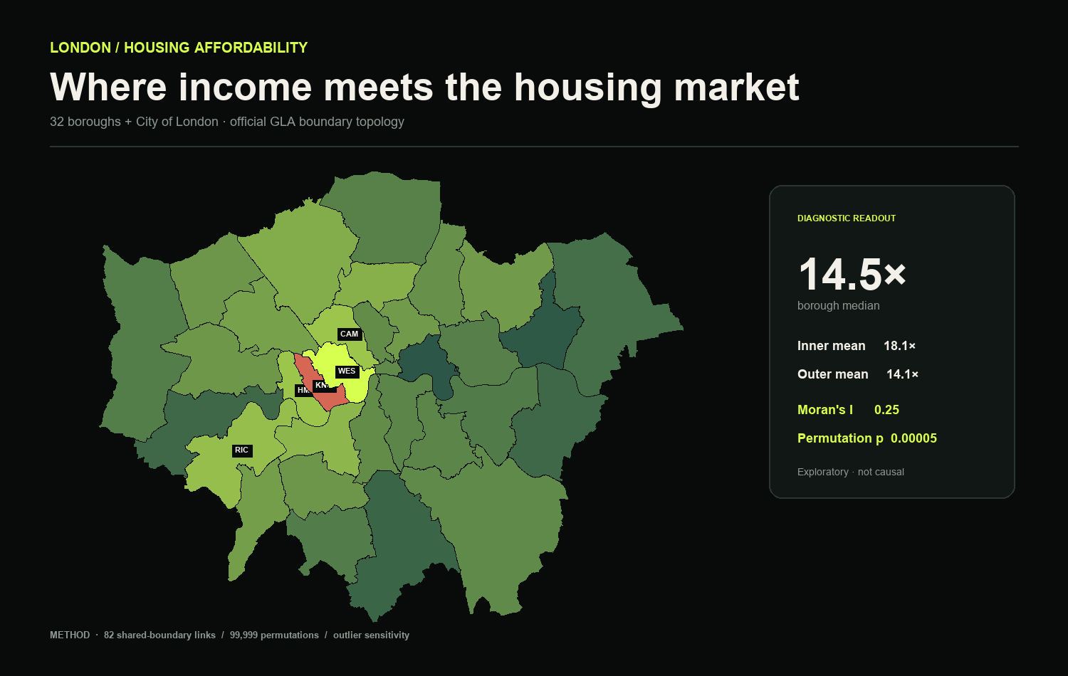
How does the house-price-to-earnings ratio vary across London boroughs, and is it spatially clustered?
The mean ratio is 18.1 in Inner London and 14.1 in Outer London, a difference of about 28%. Kensington & Chelsea has the highest value at 44.5. Using grid-cartogram adjacency, Moran’s I is 0.17.
A London-wide average masks substantial borough-level variation, so local patterns matter when interpreting affordability.
zᵢ is each borough’s centred affordability ratio; wᵢⱼ equals one for neighbouring cartogram cells. A positive result indicates like values are closer together than a fully random arrangement.
One script generates the statistics and final cartographic output from the source table.

CTA RAIL ACCESS · CURRENT NETWORK
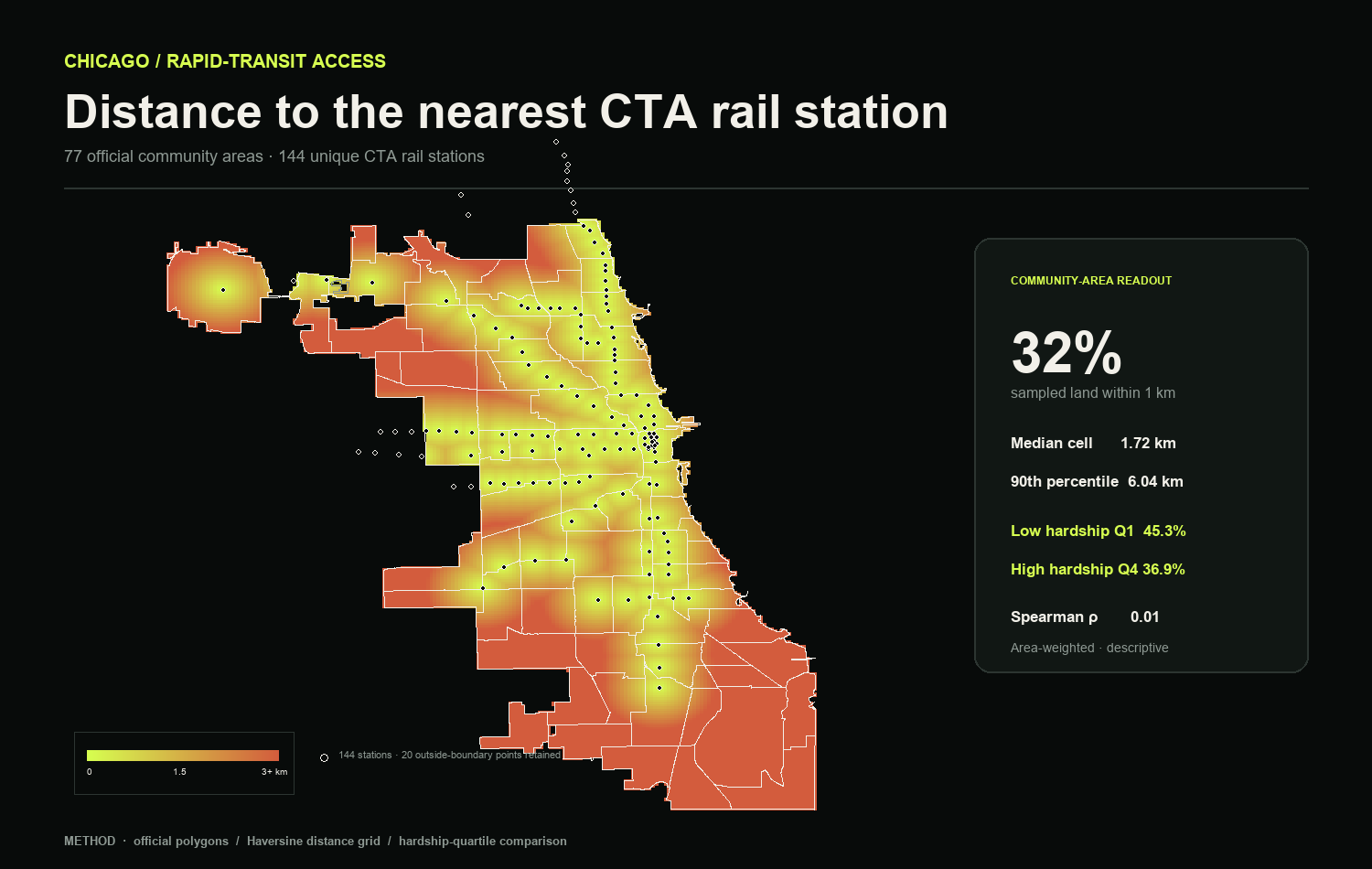
What share of the station-defined study area lies within 1 km of a CTA rail station?
The median grid cell is 1.24 km from a station; the 90th-percentile distance is 3.27 km. These figures describe the rail-network hull, not Chicago’s municipal area or population-weighted access.
Station counts alone do not show how access is distributed. The distance surface highlights gaps between rail branches.
Every valid grid cell c is assigned the minimum geodesic distance to the set of unique stations S. The resulting continuous field makes access gaps comparable across the study surface.
The full workflow deduplicates stops, builds the analytical boundary and renders the distance surface.

Methods
My workflow combines data cleaning, spatial analysis and cartographic communication. For each project, I state the unit of analysis, transformations and limitations.
Administrative records, transit feeds, property data and public APIs.
SQL · APIs · DATA QAProjection, topology, networks, buffers, joins and reproducible geoprocessing.
GEOPANDAS · QGIS · OSMNXPanel models, spatial dependence and sensitivity analysis.
PYTHON · ECONOMETRICS · LISACartography that separates evidence, assumptions and interpretation.
MATPLOTLIB · TABLEAU · WEB